Design
Through his company Typotheque, Peter Biľak has worked with major companies such as Facebook, Mozilla on branding projects; Paris metro, and Vienna airport on way-finding and information systems, as well as working with cultural clients such as Kunstmuseum Den Haag, Netherlands Architecture Institute, or a website for the Prince Claus Foundation.
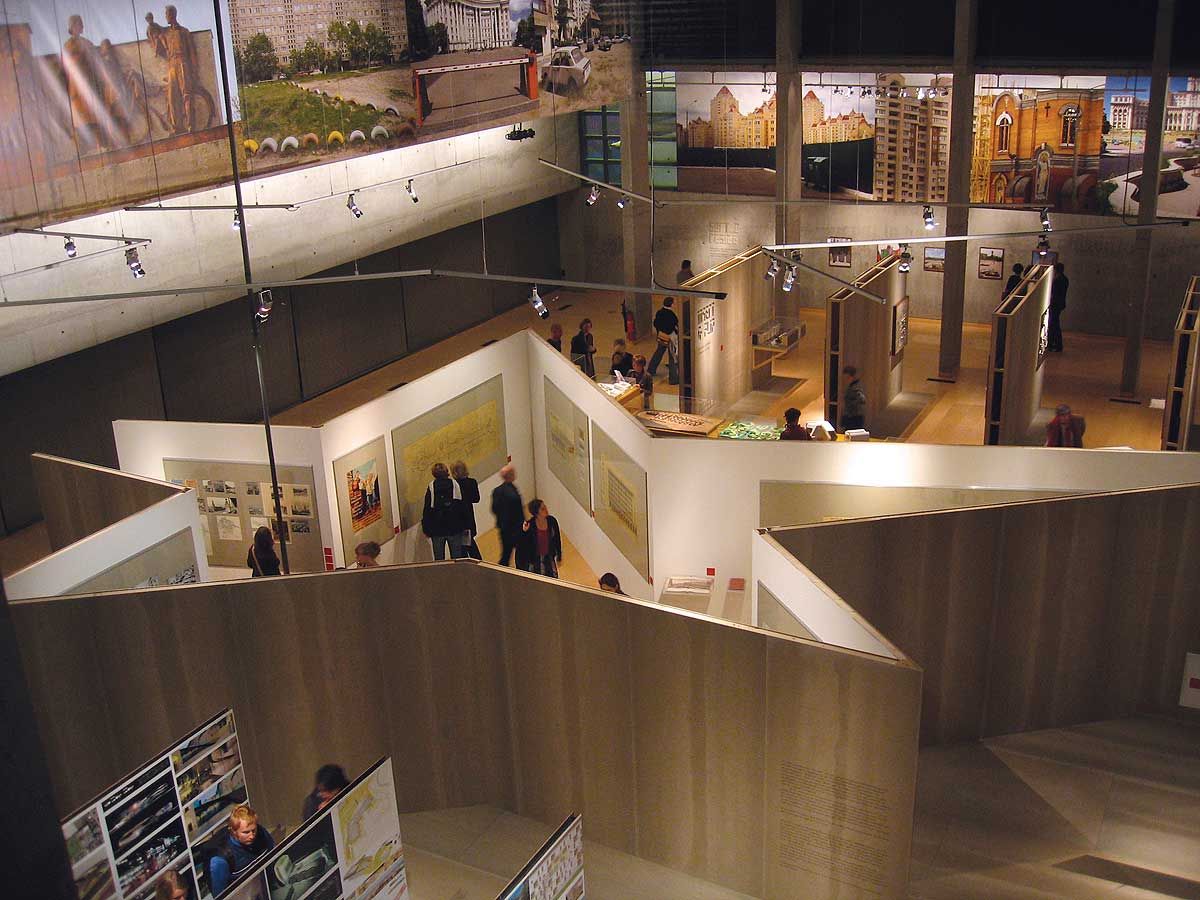
Netherlands Architecture Institute
, 2004 — In collaboration with the in-house architect from the Netherlands Architecture Institute, PB created the graphic design of an exhibition presenting architecture and urban planning in changing Eastern European cities. To reflect the content of the exhibition, the titles of the section of the show were cut into concrete panels using a high-pressure water jet. A custom stencil font using basic brick elements was designed for the occasion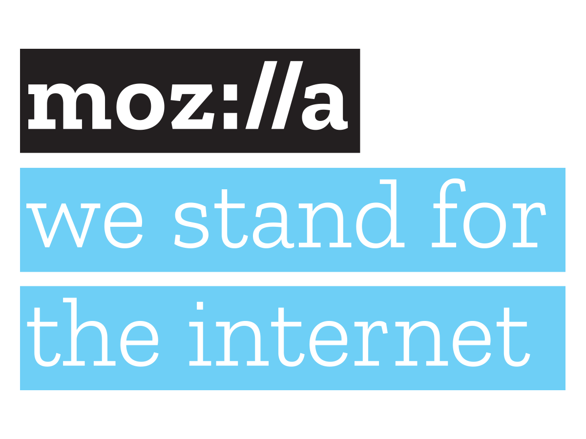
Mozilla wordmark
, 2017 — In the spirit of its open-source initiatives, Mozilla, the maker of the Firefox open-source browser, decided to be completely transparent about its entire rebranding process, documenting it extensively online. The project was executed in partnership with Johnson Banks, the London-based brand identity agency, and the public was invited to observe its development and comment on the process. After Typotheque completed the Mozilla wordmark, it was asked to design a complementary typeface to match the personality of the new logo, and created a new typeface specifically for this project, Zilla, which is freely available under an open-source licence.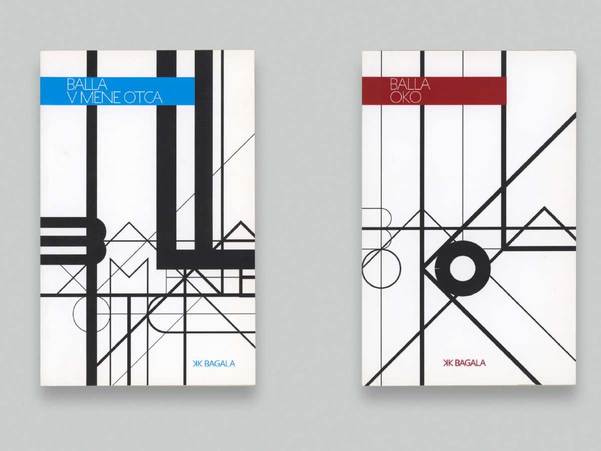
Automated book covers
, 2014 — KK Bagala is a prolific publisher of Slovak literature. Because their intense release schedule sometimes sees new books published at the rate of one a week, Biľak designed algorithmically generated book covers and simple letter contours with variable widths. Erik van Blokland wrote the Python code that automatically turns the book title and author’s name into printable artwork for the book’s cover.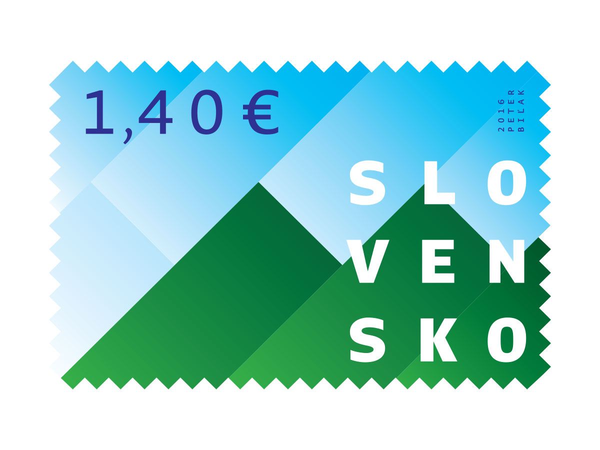
Slovakia EU presidency stamp
, 2016 — A commemorative postage stamp celebrating Slovakia’s presidency of the Council of the European Union. The postage stamp depicts Slovakia’s forests, which cover more than 40% of the country, and are pine-scented.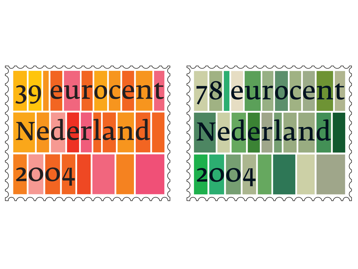
Standard postage stamps for the Royal Dutch Post
, 2004 — One of the most widely reproduced Dutch stamps, reprinted many times, and produced in over 150,000,000 copies, inspired by the Dutch landscape, the starting point being the well-known view of geometric fields from the air, the first view of the country offered to any visitor landing at Schiphol. The colour scheme is also inspired by the country itself; the 78-eurocent stamp clearly reflects the fertile agricultural land, while the colours of the 39-cent stamps find inspiration in the flower fields.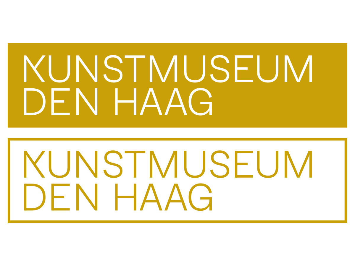
Kunstmuseum Den Haag
, 2019 — The proportions of the new Kunstmuseum logo (the former Gemeentemuseum Den Haag) are based on the original brick by the prominent Dutch architect Hendrik Berlage, who designed both the brick and the museum building. After reviewing the museum archive, Biľak selected Piet Zwart’s Nederlansche Kabefabriek poster with its unique ‘K’ as the starting point of the logo for one of the most visited museums in the Netherlands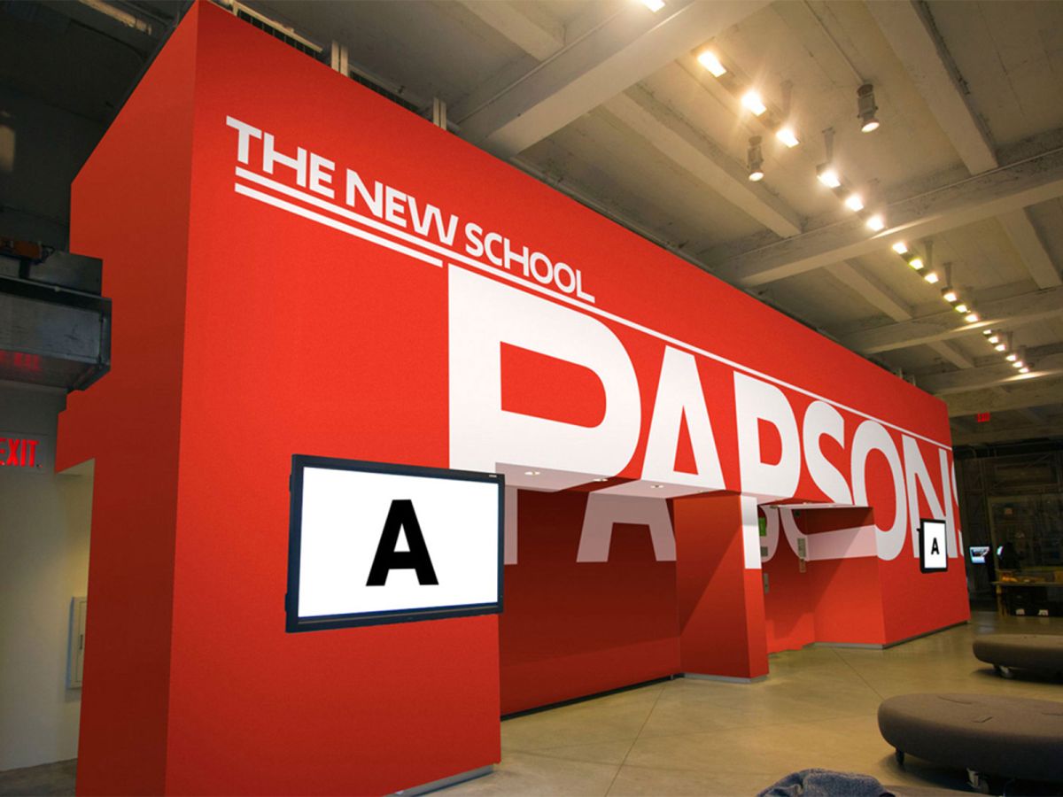
Parsons The New School
, 2017 — Pentagram’s Paula Scher designed a new identity for The New School, a progressive university in New York, commissioning Typotheque to create a bespoke typeface called Neue. The typeface combined regular, extended and very extended widths of the same font controlled by a pseudo-random algorithm written by Karsten Luecke. Using custom typography, the identity establishes an iconic brand for The New School as a whole, while also distinguishing the university’s different schools, institutes and programmes.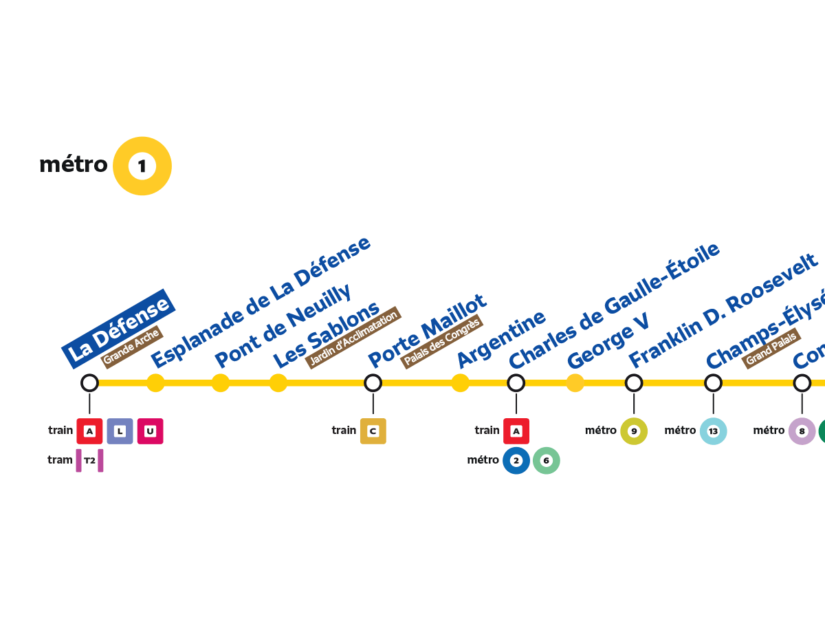
Grand Paris Express
, 2019 — Commissioned by Intégral Ruedi Baur in Paris, Typotheque has been working on the new information system of the Paris public transport network, designing a new typeface system named Grand Paris Express to create a coherent visual language for the 56 new stations. A particular challenge has been the fact that the stations are still being built, and the implementation won’t be completed until the 2030s. This is a work in progress in collaboration with Société du Grand Paris, and Intégral Ruedi Baur.